


ASX 200 Forecast 2025-Mar-28
Bounce/rally in progress.

Disclaimer: This market letter represents the views and opinions of the author. It does not constitute investment advice. It is my online journal to share knowledge of an alternative philosophy of financial markets and how I use this philosophy to trade. You should consult a financial adviser if you require professional assistance with your portfolio. I am not a financial adviser.
Summary
A meaningful bounce or rally is in progress.
Regarding the outlook for the next 2–3 years, a bear market is highly likely. It will probably commence in 3Q or 4Q2025. From peak to trough, the decline will likely be around 24%. There is the possibility that it has already commenced.
A new secular bull market will commence sometime in 2027 or 2028, defined here as a significant multi-decade advance. Wave Structure suggests it will be the greatest bull market in the history of Australian equities.
Housekeeping
I had the pleasure of being interviewed by David Martin and the crew of Quant Cartel Strategy early this morning. Click on the link to go to the interview, where I touch on many topics that run counter to how academia and the majority of financial participants view financial markets.
In the wake
Australia's benchmark share market index, the S&P/ASX 200 (ASX 200), closed at 7982 points, gaining 50.77 points or 0.6% for the week.
Exhibit 1 illustrates the price movement for the ASX 200 during the past week.
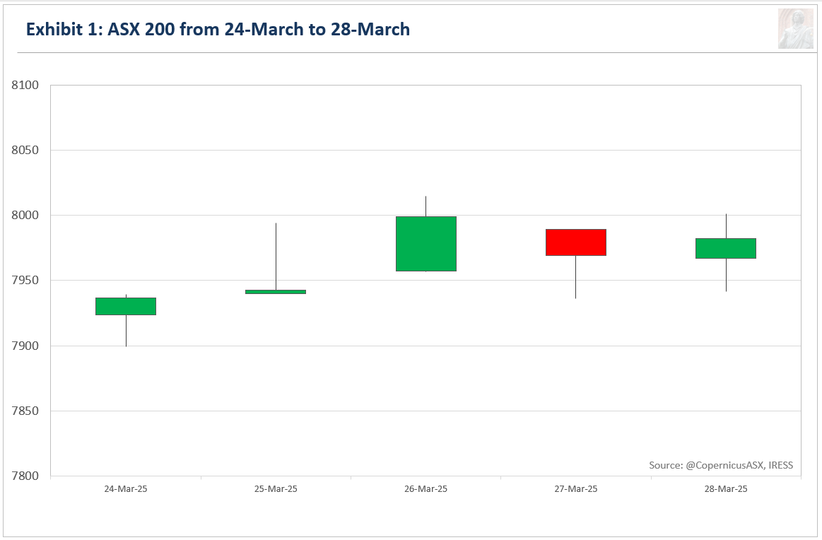
Last week, I highlighted that the risk-reward profile was skewed to the upside:
Over the next one to two weeks, I suspect potential upside risk is capped at 8300 points and downside risk limited to 7808.8 points.
This week’s rally is consistent with the prevailing interpretation, reinforcing the likelihood that it is correct.
Forecast
Exhibit 2 depicts some interpretations of price behaviour on the daily high-low chart for the ASX 200.1

This chart has not been revised since March 14.
The first scenario (the prevailing interpretation) is that the ASX 200 is in the early stages of [D] of a NEoWave Neutral Triangle (A-B-C-D-E). This price pattern is depicted with the green labelling. Two weeks ago, I rated the probability of this scenario at 75%. With a gun to my head, I would suggest the current odds are around 80%.
The second scenario is that the ASX 200 is in the early stages of [D] of a NEoWave Expanding Triangle (A-B-C-D-E). This price pattern is depicted with the orange labelling. With a gun to my head, I would suggest the current odds are around 15%.
The third scenario is that the ASX 200 is in the middle stages of [A], of either a NEoWave Contracting Triangle (A-B-C-D-E) or a NEoWave Flat (A-B-C). Part of this price pattern is depicted with the red labelling. This is the imminent crash scenario. With a gun to my head, I would suggest the current odds are around 5%.
I will focus on just the first two scenarios, which suggest [D] of either a Neutral or Expanding Triangle is unfolding.
In all Triangles (Contracting, Neutral, and Expanding), wave-D should alternate with wave-B in as many ways as possible. Alternation can occur through the following factors: price, time, percentage retracement, complexity (essentially, the number of up and down moves that comprise the wave), and construction (each leg of a triangle will subdivide into its own price pattern if the chart displays sufficient detail).
Retracement is one factor where alternation is likely to be present. [B] retraced 128% (in percentage terms) of [A] so [D] will likely retrace much less of [C]. The likely retracement range is 38 to 80%.
Time is probably another factor where alternation is likely to be present. The expected timeframe for the peak or completion of [D] is the last week of April or the first week of May per the Weekly Chart. This timeframe is calculated by taking the average duration of [B] and [C], which appears to be the best calculation in the current context. A minor or major top in that timeframe also gels well with seasonality, as markets usually experience a hiccup in May (Sell in May, go away…).
Another factor where I expect alternation to be present is complexity - essentially how messy something looks. I expect [D] to be much cleaner, simpler than [B]. In other words, I expect [D] to be boring in nature - there won’t be many big up days, and there won’t be many big down days.
In summary, I believe the ASX 200 has 8250 to 8400 in its crosshairs, with [D] peaking or completing in the last week of April or the first week of May.
Smart money
Exhibit 3 compares the ASX 200 with the Last Hour Index using the Equal-Weight ASX 200 for its calculations.2
The premise behind this indicator is that professionals with deep pockets are most active during the final hour of trading when liquidity reaches its zenith. This interval also marks the final chance to initiate or liquidate positions within regular trading hours. Therefore, the Last Hour Index offers an alternative view of risk appetite, with turning points in this indicator typically preceding turning points in the benchmark index.
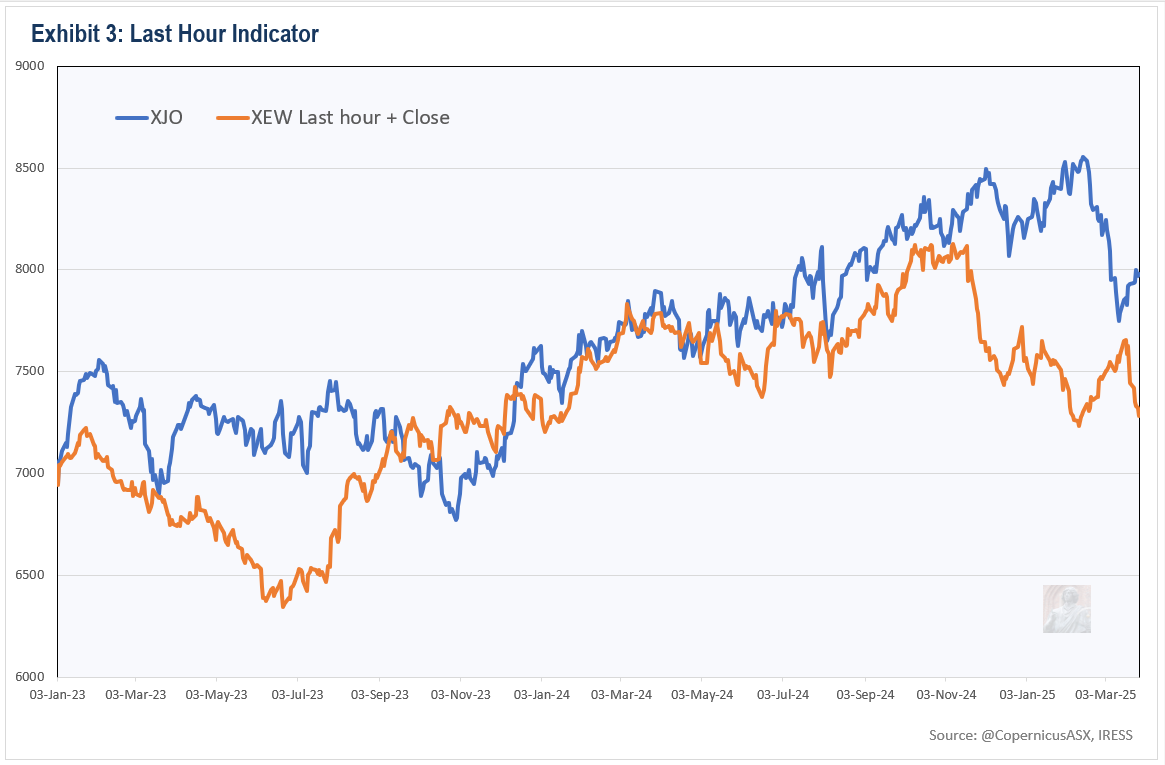
The Last Hour Index is moving lower in a notable manner. This is distinctly bearish.
The Last Hour Index using the benchmark ASX 200 Index (not shown) is close to all-time highs. This is bullish.
The disagreement between the two indices is not surprising to me. Risk aversion often rises well before a benchmark index reaches its final peak. This occurs as market participants shift their investments from riskier stocks to more liquid and safer options, which tend to have a higher weighting in the benchmark index.
Reconciling the different versions of this indicator, there are big problems ahead, but they will only become an issue for the ASX 200 itself many months from now.
Market Internals
Exhibit 4 compares the ASX 200 with the Composite Advance-Decline Line (A-D Line).
The A-D Line is a representation of the cumulative total of the number of advancing issues (stocks that closed higher) minus the number of declining issues (stocks that closed lower) each day. When most stocks are moving higher, the A-D Line rises. Conversely, a declining A-D Line indicates that most stocks are moving lower. It provides a strong indication of the health of a market trend. The greater the participation of stocks, the greater the chance the trend will continue in the foreseeable future.

The chart above does not include data for Thursday and Friday.
The ASX 200’s all-time high in February was confirmed by a higher high in the AD Line (see green lines). It would therefore be very unusual, but not impossible, for a bear market to have started, if history is any guide.
The AD Line is moving in tandem, even outpacing, the ASX 200 to the upside during this market bounce/rally. This is inconsistent with the crash scenario.
Seasonality
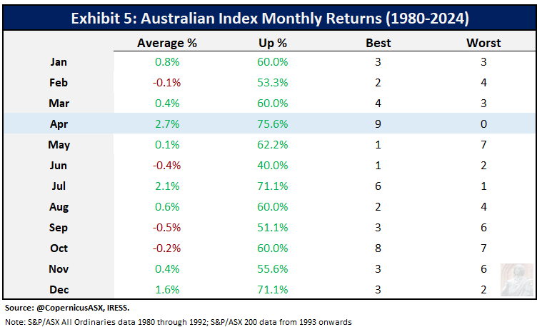
Exhibit 5 exhibits the monthly returns for the Australian benchmark index since 1980. No matter how you slice and dice the data, April is by far the best month for Aussie equities.
Geomagnetic activity is inversely correlated with market returns and is influenced by at least three short- to medium-term cycles.345 These cycles include the 182.625-day Geomagnetic Cycle, the 173.31-day Eclipse Cycle, and the 29.53-day Lunar Cycle.
The semi-annual Geomagnetic Cycle is the most important of these cycles. It refers to the changes in geomagnetic activity that occur throughout the year, with the highest activity around the equinoxes and the lowest around the solstices. The research scientist Stephen J. Puetz suggests that this cycle is the primary influence on the seasonal pattern observed in financial markets.
Last Friday was a lunar eclipse full moon, and yesterday was the March equinox. The semi-annual Geomagnetic Cycle has now turned up, providing a significant tailwind for stocks.
Risk Management
Over the next few weeks, I anticipate that the market will continue to rise gradually.
Next week, downside risk is probably no more than 120 points. Upside risk is probably in the range of 100 to 200 points.
Investment accounts
On Thursday, a very optimistic order for a copper stock was filled.
Last week, I purchased 4000 GEAR (BetaShares Geared Australian Equity ETF) at $28.86
Trading Accounts
I will patiently wait a few weeks before focusing on initiating a short position.

The view from Koča pod Bogatinom, my favourite mountain hut. Light snow/rain this morning.
Lexicon
Corrective price pattern: A reaction against the prevailing trend of one larger degree. Overlapping is a common feature although it is not a strict prerequisite. Corrections are an outgrowth of indecision or ambiguity with respect to the future. They are labelled alphabetically (A-B-C etc).
Elliott Wave Principle: the idea that market behaviour is self-affine in nature due to recurrent oscillations in public opinion across different but simultaneous timeframes. It posits that price action can be defined, quantified and classified, and used to project the future evolution of price.
Impulsive price pattern: A fast-moving market. Impulse waves produce a significant change in the price level. A distinctive feature is minimal or no overlapping, depicting a strong level of conviction about the outlook. They contain five segments labelled numerically (waves 1-2-3-4-5).
NEoWave: Neely Extensions of Elliott Wave. The body of knowledge enunciated by Glenn Neely, represents a significant break or extension of the original theory postulated by Ralph Elliott.
Price behaviour: the quantitative assessment of price action. Essentially, the largest, fastest moves are always in the direction of the prevailing psychological trend.
Wave structure: the quantitative relationship between different waves of price action.
Transmission time:
Sydney: 28-March-2025 20:04
Ljubljana: 28-March-2025 10:04
London: 28-March-2025 09:04
New York: 28-March-2025 05:04
A high-low chart plots the period's highs and lows in the order in which they occur. I only utilise price action between 10:10 and 16:00 when the market is fully open.
The ASX 200 Equal Weight Index includes the same constituents as the benchmark ASX 200 Index. The latter is a capitalisation-weighted index, while the former gives each company an equal weighting. The Official Close is included in the calculation.
Stephen Puetz, The unified cycle theory: How cycles dominate the structure of the universe and influence life on Earth (Denver: Outskirts Press, 2009).
Lifang Peng, Ning Li & Jingwen Pan, “Effect of Ap-Index of Geomagnetic Activity on S&P 500 Stock Market Return”, Advances in Astronomy 2019, https://doi.org/10.1155/2019/2748062.
Cesare Robotti & Anya Krivelyova, “Playing the Field: Geomagnetic Storms and the Stock Market”, Federal Reserve Bank of Atlanta Working Paper No. 2003-5b, (October 2003). http://dx.doi.org/10.2139/ssrn.375702
Tremendous read. Thanks.