


ASX 200 Forecast 2025-May-05
Pending downleg

Disclaimer: This market letter represents the views and opinions of the author. It does not constitute investment advice. It is my online journal to share knowledge of an alternative philosophy of financial markets and how I use this philosophy to trade. You should consult a financial adviser if you require professional assistance with your portfolio. I am not a financial adviser.
Summary
It remains likely that the ASX 200 will approach and probably breach the recent low of 7169 points.
A bear market has commenced. The decline will likely be around 24% or slightly longer from peak to trough. The approximate target is circa 6550 points. While the price pattern will likely be at least 2.5 years, the actual trough will occur in the next few months.
A new secular bull market will commence sometime in 2H 2027 (from a higher low). A secular bull market is a significant multi-decade advance. Wave Structure suggests it will be the greatest bull market in the history of Australian equities.
In the wake
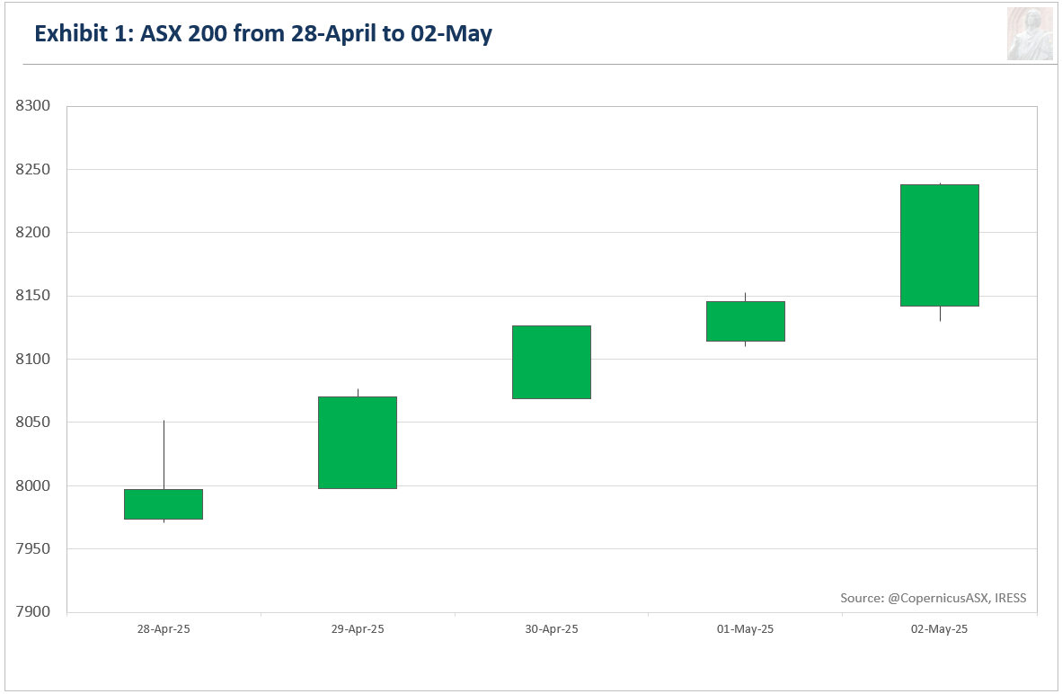
Australia's benchmark share market index, the S&P/ASX 200 (ASX 200), closed at 8238 points, gaining 269.8 points or 3.3% for the week.
Exhibit 1 illustrates the price movement for the ASX 200 during the past week.
Last week, I wrote:
Upside risk should be negligible at current levels… Close by is the nice round number of 8000 points… if 25WA begins from around 8200 points—denoted by the green circle in the chart above—then the ASX 200 is likely to struggle to reach, let alone surpass, that level for many months.
The ASX 200 hit a high of 8239.6 points for the week, which should be considered a death blow for the interpretation I was using.
Forecast
Exhibit 2 depicts the new interpretation of price behaviour on the daily high-low chart for the ASX 200.1

This forecast is quite speculative, but it is the only one that makes sense to me at present.
For the past few weeks, I have been operating under the assumption that the current price pattern started well below the highs, around 8,200 points. When a price pattern begins from a much lower level than its peak, it suggests significant weakness in the future. As a result, the market will likely struggle to approach, let alone reach, the starting point for an extended period.
With the market getting as high as it did last week, it was a death blow for that interpretation.
Ordinarily, a marginal revision is all that is required to get the forecast back on track. That appears to be the case this time too, as the only price pattern that makes sense, if we count from the very top, is a Diametric with a much larger (a) than previously assumed.
The duration of (d) is approximately the same as (a), indicating it is nearing a conclusion.
I don't have a high level of confidence in this count, but it's the only interpretation that makes sense to me at the moment. What I am certain of is that no price pattern concluded at the actual low. This suggests that the risk-reward profile remains tilted towards the downside.
Given the size of (d), the target of 6550 will likely need to be revised. I will wait to see another week of price action before doing so.
In summary, the risk-reward profile is heavily skewed to the downside over the next four weeks at a minimum. Upside risk is minimal. Downside risk is up to 1000 points. The next trending move to the downside should start this week or next.
Smart money
Exhibit 3 compares the ASX 200 with the Last Hour Index using the Equal-Weight ASX 200 for its calculations.2
The premise behind this indicator is that professionals with deep pockets are most active during the final hour of trading when liquidity reaches its zenith. This interval also marks the final chance to initiate or liquidate positions within regular trading hours. Therefore, the Last Hour Index offers an alternative view of risk appetite, with turning points in this indicator typically preceding turning points in the benchmark index.

Deep pockets (smart money) have been happy to sell into this rally.
Market Internals
Exhibit 4 compares the ASX 200 with the Composite Advance-Decline Line (A-D Line).

The A-D Line is a representation of the cumulative total of the number of advancing issues (stocks that closed higher) minus the number of declining issues (stocks that closed lower) each day. When most stocks are moving higher, the A-D Line rises. Conversely, a declining A-D Line indicates that most stocks are moving lower. It provides a strong indication of the health of a market trend. The greater the participation of stocks, the greater the chance the trend will continue in the foreseeable future.
There is a bearish divergence between the AD Line and the ASX 200. This reinforces the thesis that the current rally is a countertrend rally from a psychological viewpoint.
Risk Management
Investment Accounts
Hedged against downside risk using the Betashares Australian Equities Strong Bear Complex ETF (BBOZ).
10/04/2025. Bought 10,000 BBOZ at $28.34. Last traded price $25.85.
Trading Accounts
I remain short the ASX 200. Loss.
I am still happy to maintain these positions with the risk-reward profile skewed to the downside.

Koča pod Bogatinom. The mountain hut underneath Mount Bogatin. It looks so different with no snow.
Appendix One
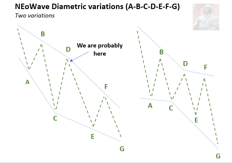
The NEoWave Diametric is a corrective price pattern composed of seven segments or waves: four trending or directional waves labelled A, C, E, and G, and three countertrend or nondirectional waves B, D, and F.
Diametrics have two main characteristics: first, they expand during the first four waves and then contract, or the reverse may occur. These variations are illustrated above. Second, five out of the seven waves show significant similarity in duration and complexity.
Price
No Fibonacci relationships exist between adjacent or alternate waves.
The trending waves (A, C, E and G) tend to pair off. Two will be “x” price length while the other two are “y” price length.
Two of the corrective waves (B, D or F) will be similar in price.
Wave G will usually mimic Wave A or be related by 61.8% in price and time.
Time and Complexity
Five of the seven waves tend to be similar in time and complexity.
One of the waves will usually be twice as long in duration as the “similar” waves.
It is uncommon for five consecutive wave segments to have the same duration.
Lexicon
Corrective price pattern: A reaction against the prevailing trend of one larger degree. Overlapping is a common feature although it is not a strict prerequisite. Corrections are an outgrowth of indecision or ambiguity with respect to the future. They are labelled alphabetically (A-B-C etc).
Elliott Wave Principle: the idea that market behaviour is self-affine in nature due to recurrent oscillations in public opinion across different but simultaneous timeframes. It posits that price action can be defined, quantified and classified, and used to project the future evolution of price.
Impulsive price pattern: A fast-moving market. Impulse waves produce a significant change in the price level. A distinctive feature is minimal or no overlapping, depicting a strong level of conviction about the outlook. They contain five segments labelled numerically (waves 1-2-3-4-5).
NEoWave: Neely Extensions of Elliott Wave. The body of knowledge enunciated by Glenn Neely, represents a significant break or extension of the original theory postulated by Ralph Elliott.
Price behaviour: the qualitative assessment of price action. Essentially, the largest, fastest moves are always in the direction of the prevailing psychological trend.
Wave structure: the quantitative relationship between different waves of price action.
Transmission time:
Sydney: 05-May-2025 14:23
Ljubljana: 05-May-2025 06:23
London: 05-May-2025 05:23
New York: 05-May-2025 00:23
A high-low chart plots the period's highs and lows in the order in which they occur. I only utilise price action between 10:10 and 16:00 when the market is fully open.
The ASX 200 Equal Weight Index includes the same constituents as the benchmark ASX 200 Index. The latter is a capitalisation-weighted index, while the former gives each company an equal weighting. The Official Close is included in the calculation.